Checkout Optimization Courses: What to Learn and How to Choose
Checkout Optimization Courses: What to Learn and How to Choose

A good checkout optimization course teaches you to find where buyers drop out between your sales page and the thank-you page, and to fix each leak with a tested change. If you sell a program, a coaching offer or a paid community, you can also learn the core of it in an afternoon, because the same handful of fixes cover most of the problem: fewer fields, visible trust cues, a clean mobile layout, clear payment and refund terms, and a habit of testing.
This guide does both jobs. First, how to judge a course. Second, the checkout practices a course should cover, so you can check any syllabus against them.
TL;DR
- Pick a course that covers the whole path (sales page, checkout, payment, thank-you page, delivery), not only button colors.
- Look for mobile-first teaching, trust and refund wording, payment plans, and a method for testing changes.
- Research on ecommerce checkouts shows about 70% of carts are abandoned, so even small friction fixes matter.
- Avoid courses that promise a fixed conversion lift. Your results depend on your offer, price and traffic.
- If you would rather not do this yourself, a managed launch partner can build and test the checkout for you.
Table of Contents
- What checkout optimization means for a creator
- Why it matters: what the research says about abandonment
- What a good checkout optimization course should teach
- How to choose a course: a quick evaluation guide
- Checkout page best practices you can apply today
- How to test whether your changes work
- Perspective
- Want a checkout built and tested for you?
- FAQ
- Sources
What checkout optimization means for a creator
For someone selling a course or digital product, checkout optimization is the work of improving everything between “I want this” and “I have paid and can access it.” That means the checkout page where buyers enter contact and card details, the payment methods on offer, the confirmation email, and the thank-you page that delivers access.
The goal is simple: a higher share of qualified visitors complete payment. You get there by removing effort and uncertainty, not by adding persuasion. Buyers of a $300 program have usually already decided on the sales page. The checkout’s job is to avoid giving them a reason to hesitate.
That is why checkout optimization is different from copywriting. Your sales page creates desire. Your checkout protects it.
Why it matters: what the research says about abandonment
Baymard Institute, a usability research firm, puts the global average cart abandonment rate at 70.19%. That figure comes from physical-goods ecommerce, so treat it as directional for digital products. Some of that abandonment is natural: people browse, compare prices or get interrupted.
But part of it is avoidable. In the same research, 17% of US online shoppers said they abandoned an order because the checkout was too long or complicated. Separately, 19% of surveyed US users said they had abandoned a checkout in the previous three months because they did not trust the site with their card information.
Two lessons for creators:
- Complexity costs sales. Every extra field, account requirement or unexplained step is a reason to leave.
- Trust is perceived, not just real. Baymard’s work shows people judge security from how clear and solid the payment area looks. A page can be technically safe and still look doubtful.
What a good checkout optimization course should teach
Use this as a syllabus test. If a course skips more than one of these, keep looking.
1. The full flow, not one page
The course should map the path from sales page to access: the click on the buy button, the checkout form, payment, confirmation email, login or access link, and the thank-you page. Leaks often hide after payment, for example a confirmation email that lands in spam or an access link that fails.

2. Form fields and friction
A strong lesson here explains which fields you truly need. For most digital products that is name, email and payment details, plus billing address only where your payment setup or tax rules require it. Baymard’s guidance on reducing cart abandonment recommends cutting unnecessary form fields, and it reports that 18% of users abandon because of checkout complexity.
Google’s own checkout guidance for merchants points the same way: it recommends guest checkout and optional business fields. A course should show you how to apply that to a creator offer, where forcing buyers to create an account before paying is a common and avoidable obstacle.
3. Trust and security signals
The course should teach you to place recognizable payment logos, a plain-language refund policy and contact details close to the payment form. It should also cover the basics Google lists for merchants: a valid SSL certificate and protection of payment and personal information, as set out in its checkout requirements.
If a lesson only says “add badges,” it is thin. Good teaching explains why the payment area must look orderly and unambiguous, since confusing layouts can trigger doubt even on a secure page.
4. Mobile checkout
For Instagram-led creators, most buyers arrive on a phone. A course should cover large tap targets, minimal scrolling, the right keyboard for each field (email, numeric card entry, postal code) and express options such as Apple Pay, Google Pay or PayPal placed above the form. Our guide to mobile-first sales pages covers the page that comes right before checkout.
5. Pricing, payment plans and billing clarity
A creator checkout is not a shopping cart. The buyer is making a deliberate purchase, often of several hundred dollars, so the course should teach you to show the total price, any installment schedule, the guarantee and the refund window on the checkout itself. Surprise charges are the fastest way to lose a buyer at the last step.
Payment plans deserve their own lesson. Offering a small set of options can reduce the cost objection for buyers who cannot pay in full. We break down how to structure them in payment plan options, and if you sell recurring access, membership pricing strategy explains how pricing ties into churn. A good course also covers failed recurring payments, since a card that fails in month three is lost revenue unless your payment setup retries it.
6. Testing and measurement
This is what separates a course from a list of tips. You should learn to track how many people reach each stage (sales page view, checkout start, payment, thank-you page) and to change one thing at a time. A/B testing needs enough traffic to mean anything, so a good course explains what to do when your volume is small: make the obvious fixes first, then test bigger changes rather than button shades.
7. A pre-launch checklist
Before any launch, you should complete a test order and check the receipt, the access link, the order record and the refund path. A course that teaches this saves you from the worst launch-day failure: buyers who paid and cannot get in.
How to choose a course: a quick evaluation guide
Syllabus coverage is only half of the decision. Judge the rest with these questions.
| Question | Good sign | Warning sign |
|---|---|---|
| Who is it for? | Built for digital products, courses or coaching | Generic ecommerce retail only |
| Does it show real pages? | Teardowns of actual checkouts with before and after | Slides of abstract principles |
| What does it say about results? | Explains that outcomes vary by offer and traffic | Promises a fixed percentage lift |
| Does it cover mobile and payments? | Dedicated lessons on both | One slide on responsive design |
| Is it current? | Mentions current wallets, payment plans and tax or refund rules | Examples that feel a decade old |
| What do you get at the end? | A checklist, test plan or template you can reuse | Only video lessons |
A few practical filters help too. Check how recently the content was updated, because payment tools change quickly. Look for a lesson length that matches the topic: a 40-minute course can introduce the ideas, but it will not make you able to diagnose your own funnel. And be wary of courses whose main goal is to sell you a particular tool. Checkout principles should work on whatever platform you use.
Finally, be honest about your stage. If you have not launched yet, your biggest gains come from the offer, price and audience, not from checkout tweaks. A course on checkout will not rescue a program that people do not want.
Checkout page best practices you can apply today
While you compare courses, these fixes cost nothing and fit most creator offers.
Cut the form to the minimum
Ask only for what you need to take payment and deliver access. Remove phone number, company name and “how did you hear about us” fields from the purchase step. Ask them after payment, on the thank-you page, if you need them at all.
Put express payment first
Offer wallet options above the card form so a buyer on a phone can pay in a couple of taps. Keep the list of methods relevant to your audience. If your buyers are in the Balkans or the diaspora in Germany, Austria and Switzerland, check which local methods your payment provider supports. Then remove the ones nobody uses, since each one adds clutter.
Make the money terms impossible to miss
Show, near the pay button:
- the total price and currency
- the installment schedule, if any
- the guarantee or refund window and who to contact
- what the buyer receives and how fast
The fewer questions a buyer has at this stage, the fewer exits.
Keep the page quiet
Remove the navigation menu, side offers and extra links from checkout. Deliberate buyers need reassurance and a clear path, not new things to read. A short recap of what they are buying, with the product name and price, keeps them oriented.
Design for the thumb
Use big buttons, short pages and a visible pay button. Test the full purchase on at least two phones, one iPhone and one Android, on mobile data, not only Wi-Fi.
Fix what happens after payment
The thank-you page should confirm the order, say exactly what happens next and give access immediately or explain when it will arrive. Send the receipt and login email within seconds, and check that it does not land in spam.
How to test whether your changes work
Start by writing down your baseline: visitors to the sales page, clicks to checkout, completed payments. Change one element, such as removing a field or moving the refund note, and let it run until you have enough orders to compare. If your traffic is modest, you may need weeks, not days, and you should favor changes with a clear logic over guesses.
One published example shows the scale of what is possible, with a caveat. A 2012 PayPal study of German businesses reported a 9.91% conversion increase after a set of checkout improvements. It is an older, ecommerce-focused result, so do not expect the same number. Treat it as proof that cumulative small fixes can add up, not as a target.

Then repeat. Checkout work is a loop of measuring, changing and measuring again, not a one-time project.
Perspective
We run launches for creators in Southeast Europe and the Balkan diaspora, and the pattern we see is consistent: creators lose more sales to unclear payment steps than to weak offers. A buyer who followed you for two years and is ready to pay should never have to wonder whether the card form is safe or what happens after they click.
That is why we treat checkout as part of the product, not an afterthought. Our work covers audience research, product structure, pricing, sales copy, video sales letters, payment setup and paid ad post-production, so the checkout is built to match the promise made on the sales page. We work on revenue share with no upfront cost to the creator, which means we only earn when your checkout converts. That keeps our attention on the details a course would tell you to check.
Our creators have generated over $500,000 in tracked revenue across seven launched programs, including one launch with more than 3,000 sales in ten days and a campaign that returned 18x on ad spend. Results like these come from the whole system working together, and a well-built checkout is one of its quiet parts.
Money
Want a checkout built and tested for you?
If you have an audience of 20K to 500K followers and have never sold a product, learning checkout optimization on top of everything else can slow you down. Money Plug Lab handles the product architecture, pricing, sales copy, payment infrastructure and launch campaign on a revenue-share basis, with zero upfront cost. You focus on the content and your community.
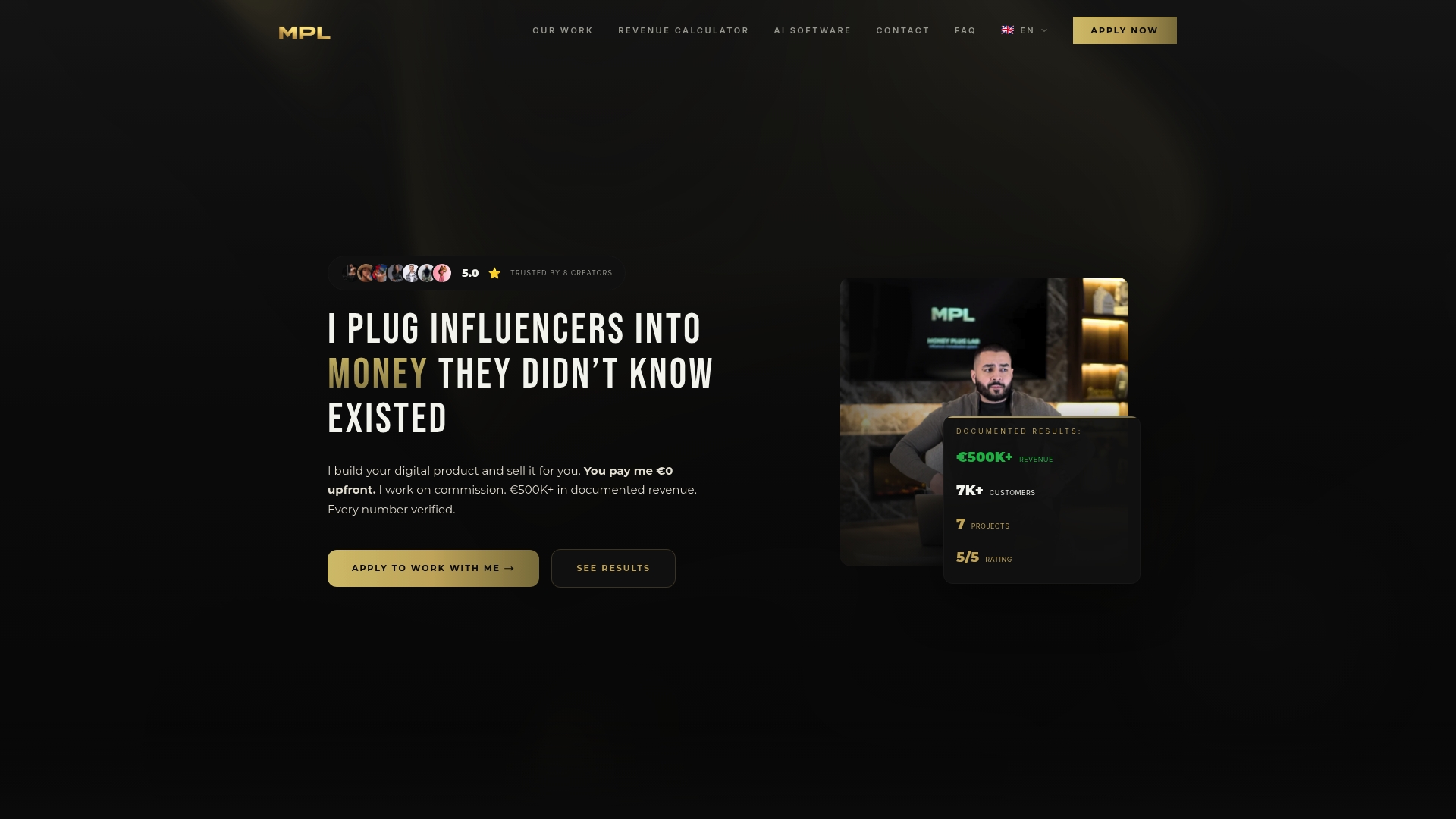
See how it works on the Money Plug Lab home page, or read more on payment processing optimization.
FAQ
Are checkout optimization courses worth it for a solo creator?
They can be, if the course is built for digital products and ends with a checklist you can apply. If you have few sales so far, the basics in this article will give you most of the benefit, and a longer course makes more sense once you have steady traffic to test with.
How many fields should a course checkout have?
As few as your payment setup allows. Name, email and payment details cover most digital products. Baymard’s research recommends removing unnecessary form fields, and each extra one gives buyers another reason to leave.
What builds trust on a checkout page?
A clean, orderly payment area, recognizable payment logos, a visible refund policy and clear contact details. Baymard’s research shows people judge safety by how the payment area looks and behaves, so clarity matters as much as the technical setup.
Should I offer payment plans at checkout?
For higher-priced programs, usually yes, because they ease the cost objection for buyers who cannot pay in full. Keep the options few and show the schedule and total clearly. Our payment plan guide goes through structures that work under $200 and above.
How do I know my checkout is working?
Track how many people move from sales page to checkout to completed payment, and run a test order before every launch. Change one thing at a time and compare results over a long enough period to have a meaningful number of orders.
Sources
- Reasons for Cart Abandonment, Baymard Institute
- How Users Perceive Security During the Checkout Flow, Baymard Institute
- How to Reduce Cart Abandonment, Baymard Institute
- Checkout requirements and best practices, Google Merchant Center Help
- Checkout Conversion guide, PayPal