How to Write Sales Page Copy That Actually Sells
How to Write Sales Page Copy That Actually Sells

Sales page copy is the persuasive writing on a single, focused web page built to turn a visitor into a buyer. It works when it does one job: get one type of visitor to take one action.
Before you draft a word, lock down five things:
- One offer — not three, not a menu
- One target audience — the specific person you’re writing to
- One primary CTA — repeated, not competing with a second option
- A headline that names the outcome, not the product category
- Your strongest proof item — the stat, result, or testimonial that does the heaviest lifting
Pro Tip: Write your headline last. You’ll know what actually matters once the rest of the page is drafted.
Once you have those five pieces, you can draft a rough headline in the next ten minutes using the formulas further down this guide.
Key Takeaways
A sales page converts best when it commits to one offer, one audience, and one call to action, then backs every claim with proof placed right next to the sentence it supports.
| Point | Details |
|---|---|
| Single-purpose structure | Build around one offer, one audience, and one CTA, removing navigation and competing offers. |
| Headline carries the page | The headline and opening lines drive most of the page’s performance, so write and test them first. |
| Thread proof throughout | Place testimonials and results next to the specific claims they support instead of grouping them at the bottom. |
| Match length to price | Keep impulse offers under 700 words; reserve long-form, 15-point structures for high-ticket coaching. |
| Test one variable at a time | Prioritize headline, hero CTA, and checkout friction before testing smaller page elements. |
| Money-plug builds full launches | Money-plug writes and launches sales page copy for creators on a revenue-share basis, with no upfront cost. |
Table of Contents
- What Makes Sales Page Copy Different From Other Landing Pages
- The Core Elements Every High-Converting Sales Page Needs
- Which Copy Frameworks and Headlines Actually Convert?
- How Do You Write a Sales Page Step by Step?
- Annotated Sales Page Templates You Can Adapt
- What Should You Test First on a Sales Page?
- Common Sales Page Mistakes That Kill Conversions
- How Money-plug Builds Sales Pages for Creator Launches
- Where Sales Copywriting Crosses a Legal Line
- Why We Build One Offer, One CTA, Every Time
- Get a Hands-Off Sales Page Built for Your Launch
- Frequently Asked Questions
- Sources
What Makes Sales Page Copy Different From Other Landing Pages
A sales page is a standalone page built for one purpose: closing the sale, not collecting an email or introducing a brand. Jasper’s breakdown of high-converting sales pages frames this narrow focus as the defining trait that separates a sales page from a homepage or a general landing page.
A homepage has to serve ten different visitor intents at once. A lead-magnet page just wants an email address. A product page on an e-commerce site often competes against dozens of other products in the same catalog. A sales page has none of that competition, because you removed it on purpose.
- Homepage: multiple goals, multiple audiences, built for navigation
- Product page: transactional, often comparison-driven, light on narrative
- Lead magnet page: low commitment, single field, no real “offer” to sell
- Sales page: one offer, one CTA, built to walk a specific reader from doubt to decision
The length depends on price and how warm your traffic is. A $17 digital download aimed at your email list can convert on 400 words. A $2,000 coaching program aimed at cold Facebook traffic usually needs long-form copy that answers every objection before the reader hits the buy button.
The Core Elements Every High-Converting Sales Page Needs
Every sales page that consistently converts is built from the same handful of load-bearing parts, arranged in roughly the same order. Shopify’s guide to sales page examples points to persuasive messaging, a distraction-free layout, layered social proof, and a strong, repeated call to action as the shared traits behind pages that actually move product. Miss one of these and the whole structure gets shaky, no matter how good your writing is.
The hero area
This is the top of the page, the part visible before anyone scrolls. It needs three things working together: a headline that states the outcome, a subheadline that adds the mechanism or the “how,” and a primary CTA button. Many high-performing pages also drop a proof signal right here, a client logo, a review count, or a one-line result, so the reader’s first impression includes evidence, not just a promise.
Structural research on top-converting pages found that a five-block skeleton, hook, problem, demonstration, social proof, and call to action, shows up again and again across high-performing pages in wildly different industries. The headline and the first few lines carry an outsized share of the page’s total performance. Get the top third wrong and nothing below it matters.
Problem and agitation
Before you sell the solution, name the problem in the reader’s own words. This section should feel like you’ve read the reader’s mind. Pull phrasing from actual customer reviews, support tickets, or comments on your own posts. Generic pain points (“struggling to grow your business”) read as filler. Specific ones (“you’ve tried three meal plans and still can’t get past week two”) read as proof you understand the exact person you’re writing to.
Demonstration and proof of the product itself
Show, don’t just claim. Annotated screenshots, a short demo video, before-and-after images, or a walkthrough of the actual deliverable all do more work than another paragraph of adjectives. If you’re selling a course, show the course dashboard. If you’re selling a coaching program, show a session recap or a client’s actual results.

Feature-to-benefit translation and the offer stack
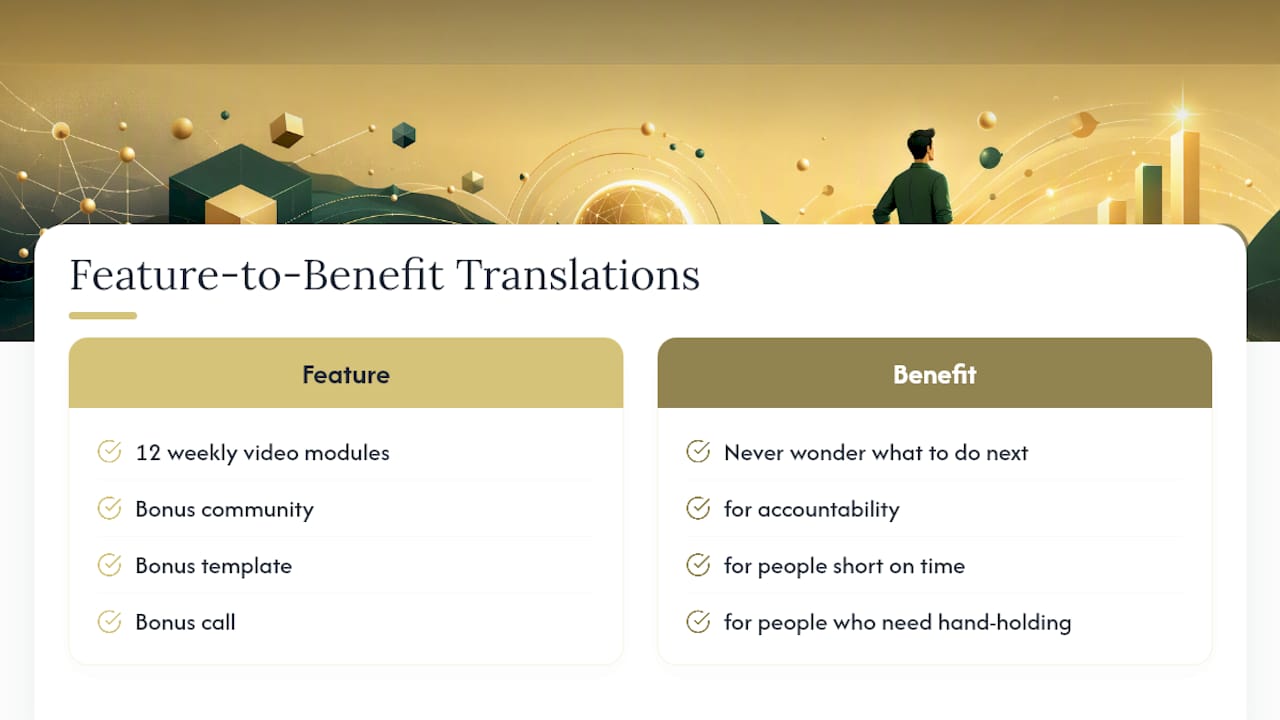
List every component of what the buyer gets, then next to each one, translate what it means for their life. “12 weekly video modules” is a feature. “You’ll never wonder what to do next, because the next lesson unlocks automatically” is the benefit. Stack the core product with bonuses that remove specific objections: a bonus community for accountability, a bonus template for people short on time, a bonus call for people who need hand-holding.
Social proof, distributed rather than dumped
Don’t save every testimonial for a wall at the bottom of the page. The same structural analysis recommends threading proof through the page, placing a specific testimonial right next to the claim it backs up. If you say the program improves consistency, put a testimonial about consistency in that exact spot, not three sections later. Logos, screenshot reviews, case study numbers, and short quotes each play a different role: logos signal scale, quotes signal relatability, case studies with numbers signal results.
The order area
This is where pricing, guarantee, and the actual checkout live. Keep the form or checkout button as frictionless as possible, minimal fields, clear pricing, no surprise costs revealed at the last step. A strong risk reversal (a money-back guarantee, a trial period, a satisfaction promise) belongs directly next to the price, because that’s the exact moment doubt peaks.
“One offer, one target audience, and one primary call to action.” That’s the entire filter Copyhackers uses to judge whether a sales page will convert or bleed visitors through unnecessary exits.
Secondary components that still matter
- FAQ section that pre-answers objections before they become reasons to leave
- Scarcity or urgency when it’s real (a cart-close date, limited cohort size), never fabricated
- Trust badges like secure checkout icons or media mentions, small but real credibility signals
- Minimal or no navigation so there’s nowhere else on the page to click except the CTA
One practical note worth repeating from experienced sales page copywriters: not every template section belongs on every page. If your audience doesn’t need an FAQ because the offer is simple and cheap, cutting it keeps the page tighter, not weaker.
Which Copy Frameworks and Headlines Actually Convert?
You don’t need to invent a structure from scratch. Four frameworks cover almost every sales page situation, and each one solves a slightly different problem.
- AIDA (Attention, Interest, Desire, Action) works best for cold traffic that’s never heard of you. The headline grabs attention, the middle builds interest and desire, the close drives action.
- PAS (Problem, Agitate, Solution) is the fastest way to write emotionally resonant copy for a known pain point. State the problem, dig into why it hurts more than the reader admits, then present your offer as the resolution.
- FAB (Feature, Advantage, Benefit) forces you to translate every product spec into a real-world outcome, which fixes the single most common mistake in weak sales copy: listing features nobody asked for.
- The 15-point template mirrors the flow of a one-on-one enrollment call, and it’s purpose-built for creator launches and long-form offers where the reader needs every objection answered before checkout.
Headlines follow patterns too. Steal these structures and swap in your own specifics:
- Benefit-led: “Get [specific result] in [timeframe], even if [common objection]”
- Curiosity: “The [surprising method] that [audience] use to [result]”
- Problem/solution: “Tired of [pain point]? Here’s what actually fixes it”
- If/without: “How to [result] without [thing they fear giving up]”
CTA copy deserves the same testing rigor as headlines. Possessive framing (“Start My Plan”) often outperforms generic commands (“Start Now”) in tests where the offer feels personal, though results vary by audience and context, so treat it as a hypothesis to test, not a guarantee.
Quick swipe file to adapt:
- “Get Instant Access”
- “Claim Your Spot”
- “Start My 7-Day Trial”
- “Reserve My Seat”
- “Yes, I’m In”
- “Show Me How”
- “Send Me the Plan”
- “Unlock the Program”
How Do You Write a Sales Page Step by Step?
Writing sales page copy is a sequence, not a single sitting. Skip the early steps and you’ll spend twice as long revising later.
- Research first. Read every review, comment, and support message your audience has left about similar products. Interview two or three past customers if you can. You’re mining for their exact words, because the closer your copy matches how they already describe the problem, the more it feels like you’re reading their mind.
- Outline before you draft. Block out hero, problem, mechanism, proof, offer, and close, and assign each a rough word budget. A 1,500-word page might run 150 words for the hero, 250 for the problem, 300 for the mechanism, 400 for proof and offer combined, and 200 for the close.
- Draft fast, write to one person. Picture a single reader, not a crowd, and use “you” throughout. Every time you write a feature, immediately write what it means for that one person. Conversion copywriters consistently push this single-reader mindset because copy written to “everyone” tends to persuade no one.
- Edit ruthlessly. Cut any sentence that doesn’t earn the reader’s attention for the next one. Aim for a reading level accessible to a broad audience, short paragraphs, and sentences a tired reader can skim without rereading.
- Publish, then test. Set up tracking before launch: pick one primary metric (usually conversion rate), decide your first two or three A/B test ideas, and roll the page out to a small slice of traffic before pushing it everywhere.
The opening 200 to 300 words carry disproportionate weight. Conversion copywriting research points out that most visitors decide whether to keep reading based on the headline and the first sentence alone, which is exactly why step 2’s outline puts so much budget into getting the hero right before you write another word.
Pro Tip: Draft your outline, then walk away for an hour before you write full sentences. You’ll catch structural gaps you’d otherwise write straight past.
Annotated Sales Page Templates You Can Adapt
Price point changes everything about how much persuasion a page needs. Here’s what three common tiers actually require, with the fat trimmed.
Impulse product ($7 to $47). Keep this short, 400 to 700 words. Skip the long origin story and the extended objection-handling. You need: one punchy headline, a two-sentence problem statement, three to five bullet benefits, one testimonial, and a CTA that repeats twice.
Edit-in-place headline: “The 5-Minute Fix for [Specific Problem], Even If You’ve Tried Everything Else”
Edit-in-place close: “Grab it now for $[price], one-time payment, instant access.”
Course or program ($97 to $497). This tier needs 1,200 to 2,000 words. Add a mechanism section (why this method works when others haven’t), a module-by-module breakdown translated into benefits, two to three testimonials placed near relevant claims, and a guarantee.
Edit-in-place lead: “If you’ve bought courses before and still haven’t finished one, this page is for you, not because this program is easier, but because it’s built differently.”
High-ticket coaching ($997 and up). This is where the 15-point enrollment-call structure earns its keep. Expect 2,500 to 4,000 words, a detailed founder story, multiple proof blocks (case studies with real numbers, not just quotes), a thorough FAQ answering pricing and time-commitment objections, and a strong guarantee since the buyer’s risk feels bigger.
The 15-point structure works because it “coaches the conversion,” walking a cold reader through the same emotional beats a skilled closer would hit on a live enrollment call, just in written form.
Every annotation note boils down to one question: what does this specific line need to accomplish before the reader moves to the next one? If a sentence doesn’t answer an objection, build desire, or add proof, it’s decoration, and decoration is exactly what gets cut in editing.
What Should You Test First on a Sales Page?
Not every element deserves equal testing attention. Prioritize in this order:
- Headline — it affects everyone who lands on the page, so even a small lift compounds across all traffic
- Hero CTA and hero proof — the first screen a visitor sees before deciding to scroll
- Primary proof placement — whether a testimonial near the top outperforms one buried lower
- Checkout friction — form fields, number of steps, and payment options
Run one test at a time. Structural analysis of top-converting pages warns against changing five elements simultaneously, because you’ll have no idea which change actually moved the number. Give each test enough traffic to reach a meaningful sample before calling a winner, and expect most individual tests to deliver modest gains rather than dramatic ones. The compounding happens over many disciplined test cycles, not one lucky headline swap.
Track conversion rate as your primary metric, but watch revenue per visitor and average order value too, since a change that boosts conversion but tanks order value isn’t actually a win. Scroll depth and bounce behavior tell you where readers are dropping off, which points you toward your next test.
Quick wins that consistently move the needle: removing site navigation entirely, cutting form fields down to the minimum, and rewording CTA copy from generic (“Submit”) to specific (“Get My Plan”).
Common Sales Page Mistakes That Kill Conversions
Most weak sales pages share the same handful of problems, and most are fixable in an afternoon.
- Unclear headline: if a stranger can’t tell what you’re selling in five seconds, rewrite it around the outcome, not the product name
- Mixed offers: two products competing for attention on one page splits focus and tanks both
- Distracting navigation: a full site menu at the top gives visitors an exit ramp before they’ve even read your pitch
- No proof, or proof buried at the bottom: move your strongest testimonial or result higher, ideally near the claim it supports
- Vague benefits: “improve your life” says nothing; “sleep through the night within two weeks” says everything
Pro Tip: Print your page and read it out loud. Every sentence that makes you stumble is a sentence a visitor will skim past.
Formatting matters as much as the words themselves. Short paragraphs, bolded microheadlines breaking up long sections, and bullets that describe outcomes rather than just listing features all make a page easier to scan, and a page nobody reads converts nobody.
How Money-plug Builds Sales Pages for Creator Launches
Money-plug builds sales page copy for creator launches using a consistent process: audience research first, then offer architecture, then draft, then asset production, then launch optimization. That order matters, because a beautifully written page for the wrong offer still fails.
The results didn’t come from clever copy alone. They came from stacking the offer correctly, threading proof throughout the page instead of dumping it at the bottom, and stripping friction out of the checkout step before a single ad dollar was spent.
Offer stacking, distributed social proof, and reduced checkout friction are the same three levers this guide has walked through, applied at launch scale.
Where Sales Copywriting Crosses a Legal Line
Persuasive copy has boundaries, and crossing them creates real liability, not just bad optics. Income claims, health outcomes, and “guaranteed results” language fall under advertising regulations in most countries, and regulators do pursue creators and marketers who overpromise. If you can’t substantiate a claim with real data, don’t make it, soften it to what actually happened for actual customers.
Testimonials need to reflect real, typical experiences. If a result is exceptional rather than average, disclose that. Manufactured urgency, a countdown timer that resets for every visitor, a “3 spots left” claim that never runs out, erodes trust the moment a reader notices, and readers notice more often than marketers assume.
Guarantees need to mean what they say. If your refund policy has hidden conditions, spell them out before the purchase, not in fine print discovered after a complaint. The same goes for auto-renewal terms on subscription offers: disclose them clearly near the price, not buried in a terms-of-service link nobody clicks.
None of this requires stripping the personality or persuasion out of your copy. It requires backing every claim you make with something true, and being upfront about the few claims that are aspirational rather than typical. Readers can tell the difference between confident copy and copy that’s hiding something, and so can the platforms that host your ads.
Why We Build One Offer, One CTA, Every Time
We’ve never built a launch page with two competing offers, and we’re not starting now. Every navigation link, every alternate CTA, every “or check out our other program” is a door out of the sale you actually want. One offer and one CTA simplify testing too. You’re isolating one headline, one proof block, one button at a time, so when a number moves, you know exactly why.
Get a Hands-Off Sales Page Built for Your Launch
If you’ve made it this far, you now know what a high-converting page needs. Building it yourself still takes weeks you probably don’t have between content creation, client calls, and everything else running your business. Money-plug builds the entire funnel for you, audience research, offer architecture, sales copy, video sales letters, ad production, and payment setup, on a revenue-share basis with zero upfront cost.
This fits content creators, coaches, personal trainers, and niche influencers who already have an engaged audience but no time to turn that audience into a paid program or community. You bring the audience and the expertise; Money-plug handles the research, the copy, the checkout, and the ad spend that gets it in front of buyers.
Getting started means a conversation about your audience and your offer idea, not a sales pitch. If you’re ready to see what a done-for-you launch looks like, explore Money-plug’s creator monetization services and find out what a revenue-share partnership could look like for your next launch.
Frequently Asked Questions
What is sales page copy? Sales page copy is the persuasive writing on a standalone page built to close a single sale, combining a headline, proof, an offer, and a call to action around one specific product or program.
How long should a sales page be? It depends on price and audience temperature. Low-priced impulse offers to warm traffic can convert on 400 to 700 words, while high-ticket programs sold to cold traffic often need 2,500 words or more to answer every objection.
What’s the difference between a sales page and a landing page? A landing page is a broader category that includes lead-capture pages, webinar registration pages, and sales pages. A sales page is a specific type of landing page focused entirely on closing a purchase.
Which copywriting framework works best for a sales page? AIDA suits cold traffic that needs attention built from scratch, PAS works fast for audiences who already feel the pain point, and the 15-point template suits long-form, high-ticket offers modeled on a one-on-one enrollment call.
How many testimonials does a sales page need? There’s no fixed number. What matters more is placement: distribute testimonials near the specific claims they support rather than clustering all of them in one section at the bottom.
What’s the biggest mistake creators make on sales pages? Trying to sell more than one thing on the same page. Splitting attention between two offers, or leaving site navigation active, gives visitors an exit before they’ve finished reading the pitch.
Sources
- How to Create High-Converting Sales Pages That Drive Results
- Sales page examples and how to write great sales pages
- High-converting landing pages (examples and analysis)
- Sales pages: structural patterns from top-converting examples