Checkout Conversion Boosters for Creators Selling Digital Programs
Checkout Conversion Boosters for Creators Selling Digital Programs

The fastest ways to lift checkout conversion are to remove form fields, let buyers pay without creating an account, show the full price up front, make the page fast on a phone, and offer the payment methods your buyers already use. Do these first. Then measure every change one at a time. This guide shows how each booster works for a creator selling a course, coaching program or paid community, and how to check that it paid off.
TL;DR
- Cut fields before you cut steps. Most checkouts ask for more than buyers need, and long or complex forms push people out.
- Make guest checkout the default and show the total cost early. Forced accounts and surprise costs are two of the most common reasons buyers leave.
- Design for the phone first: one column, big buttons, fast load, Apple Pay and Google Pay near the top.
- Offer a payment plan on higher-priced programs and show the plan next to the full price.
- Test one change at a time and judge it on completed purchases, not clicks.
Table of Contents
- Find the leak before you fix it
- Cut form fields, not just steps
- Make guest checkout the default
- Show the full price early
- Build for the phone first
- Match the payment methods to your buyers
- Add trust where the buyer decides
- Recover buyers who leave
- Test one change at a time
- Perspective: why checkout is never the whole story
- Want a checkout that is part of a full launch?
- FAQ
- Sources
Find the leak before you fix it
A checkout change only helps if it fixes the place where buyers actually leave. Split your funnel by traffic source, device and step. If few people start checkout, the problem sits earlier: unclear offer, unclear price, or a page that does not match the ad or post that sent them. If many start and few pay, the problem is inside checkout: form friction, payment options, trust or a technical fault.

That split matters for creators, because most of your traffic comes from Instagram or TikTok links opened on a phone. A page that looks fine on your laptop can lose half its buyers on a mid-range Android.
Keep expectations realistic. Not every abandoned cart is a checkout failure. In Baymard’s usability research, shoppers report leaving for many reasons, and a share were only browsing. Your job is to fix the reasons you can control: effort, cost surprises, trust and payment fit.
Cut form fields, not just steps
Most checkouts ask for too much. Baymard’s benchmark found the average checkout had 5.1 steps and 11.3 form fields, while most sites need only about 8. It also found that the number of fields affects usability more than the number of steps. Squeezing the same fields onto fewer pages does not reduce effort.
For a digital product you rarely need a shipping address at all. A lean checkout for a program might ask for:
- Full name in a single field
- Payment details
Add a billing address or tax details only if your payment setup or local rules require them. Hide optional items such as coupon codes behind a link. Baymard’s research reports that 89% of sites fail to use a single Name field and 35% fail to hide the coupon code field, and that hiding optional fields and using address lookup reduces friction.
The pull of this advice is strongest on physical goods, but the principle carries over: every field is a small decision. Stripe’s checkout guidance says each step in checkout is a potential drop-off point, and suggests merging similar stages or using one-click checkout.
Make guest checkout the default
Asking buyers to create an account before paying is one of the clearest conversion killers. Shopify’s 2026 guide, citing Baymard’s benchmark, reports that 62% of sites fail to make guest checkout the most prominent option and that 19% of shoppers abandon rather than create an account.
For creators the fix is simple. Collect an email, take payment, then create the member login automatically and send access details by email. Baymard’s 2026 checkout UX review recommends saving account creation for the confirmation step, so buyers can complete the purchase without weighing up whether they want an account.
Show the full price early
Surprise costs hurt. The same Shopify guide reports Baymard’s finding that 14% of shoppers leave when they cannot see the total cost upfront. With digital programs, the surprise is usually not shipping. It is tax, a currency conversion the buyer did not expect, or a payment plan whose total is unclear.
On the checkout page, state:
- The program name and what is included
- The price due today, in a prominent place
- For payment plans, the amount, the number of payments and the date of the next charge
- How and when access arrives (instantly by email, or on a set start date)
- Your refund terms, in plain words, near the payment button
If you sell to buyers in several countries, show the price in their currency where your payment setup allows it. Guessing at conversion rates on a bank statement is a quiet reason people stop at the last screen.
Build for the phone first
If your audience comes from social media, the mobile checkout is your checkout. Stripe notes that a poor mobile experience can deter a sale and discourage the customer from coming back.
A practical mobile checklist:
- One column. No side-by-side fields that force pinching and scrolling.
- Large tap targets. Buttons and inputs should be easy to hit with a thumb.
- Wallet buttons on top. Put Apple Pay and Google Pay above the card form so a buyer can pay with a fingerprint or face scan.
- No pop-ups or overlays during payment. An exit-intent window on a small screen often covers the pay button.
- Right keyboard. Number pad for card and phone fields, email keyboard for the email field.
- Fast load. Compress images, drop unused scripts and test on a normal mobile connection, not office Wi-Fi.
We go deeper on the page that sends buyers into checkout in our guide to mobile-first sales pages, because a checkout can only convert the visitors the page delivers.
Match the payment methods to your buyers
There is no single best payment method. What converts depends on the buyer’s country and the price. Cards plus a digital wallet cover many buyers. Others, especially outside the US, want PayPal or a local bank method. Stripe’s guide to checkout flow design says buyers prefer different ways to pay and that limiting choices can limit revenue.
Do not enable everything indiscriminately. Look at where your traffic and sales come from, then add the two or three methods most used in those places. A creator whose audience sits in the Balkans and in Germany, Austria and Switzerland should check what those buyers actually use before assuming a US-style card checkout is enough.
Payment plans for higher-priced programs
A lump sum of several hundred dollars is a hard ask. A plan reframes it as a monthly amount. The best practice is to show the full price and the plan side by side on the same screen, lead with the monthly figure, and state any discount in dollars. How to structure a plan depends on price: we break down the options in our article on payment plan options, including pay-in-4 for programs under $200 and longer financing for larger ones.
Add trust where the buyer decides
Trust is not decoration. Baymard’s research reports that 19% of US shoppers abandoned a checkout in a three-month window because they did not trust the site with their card details, a figure cited in this review of Baymard’s waves of data.
Good trust signals are specific and sit beside the payment form:
- A recognizable payment processor logo and a secure-payment indicator
- Your name or brand and a real support route, such as an email address that gets answered
- Plain refund and cancellation terms
- A short summary of what the buyer gets, so there is no doubt about what the charge is for
- Confirmation and access instructions that arrive immediately after payment
Do not paste a wall of badges you cannot back up. One or two that the buyer recognizes beat a row of logos that mean nothing.
Recover buyers who leave
Some buyers will still drop off. Capture the email early, ideally as the first field, so you can follow up. A short, helpful message within minutes of abandonment, by email or by the channel your audience prefers, works better than a generic reminder days later. Say what they were buying, link straight back to the checkout and answer the one question that most often stops people, such as refund terms or how access works. Make sure you have the right consent to contact them under the rules that apply where they live.
Test one change at a time
A checkout boost is a hypothesis until you measure it. A simple testing routine:
- Pick one change. For example, moving the wallet buttons above the card form.
- Define the main metric. Completed purchases or revenue per visitor, not clicks on the button.
- Segment results. Compare by traffic source and device. A change can win on desktop and lose on mobile.
- Run a full sales cycle. Include a weekend and any email send or post spike, so you do not call a winner too early.
- Check downstream effects. Look at refunds, chargebacks and support messages before you roll the change out to everyone.
A sensible order of priority is speed and stability first, then payment options and placement, then clarity of terms, then layout and upsells. Upsells and order bumps come last. They can raise order value, but they should not add friction to the first payment.
Small audiences make testing harder. If you get a few hundred visitors a week, you will not detect small differences. In that case, make the changes that research already supports (fewer fields, guest checkout, wallets, clear price) and watch your overall conversion before and after, rather than running dozens of tiny tests.
Perspective: why checkout is never the whole story
We see checkout as the last 10 meters of a long race. If the offer, the price and the sales message are right, a clean checkout lets buyers finish. If they are wrong, no checkout trick will save the launch.
That is why we start further back. For every creator we work with, we begin with audience research and product architecture, then pricing, sales copy and video sales letters, and only then the payment setup and the launch campaign. Our creators have generated over $500,000 in tracked revenue across seven launched programs, including one launch with more than 3,000 sales in ten days and a campaign that returned 18x on ad spend. Those numbers come from the whole system working together, not from a single button color.
We work in Southeast Europe and with the Balkan diaspora, where buyers often pay in different ways and in different currencies than a US-only template assumes. Our model is revenue share with zero upfront cost to the creator, so we only earn when your checkout converts. That keeps us focused on the same thing you are: more completed purchases.
Money
Want a checkout that is part of a full launch?
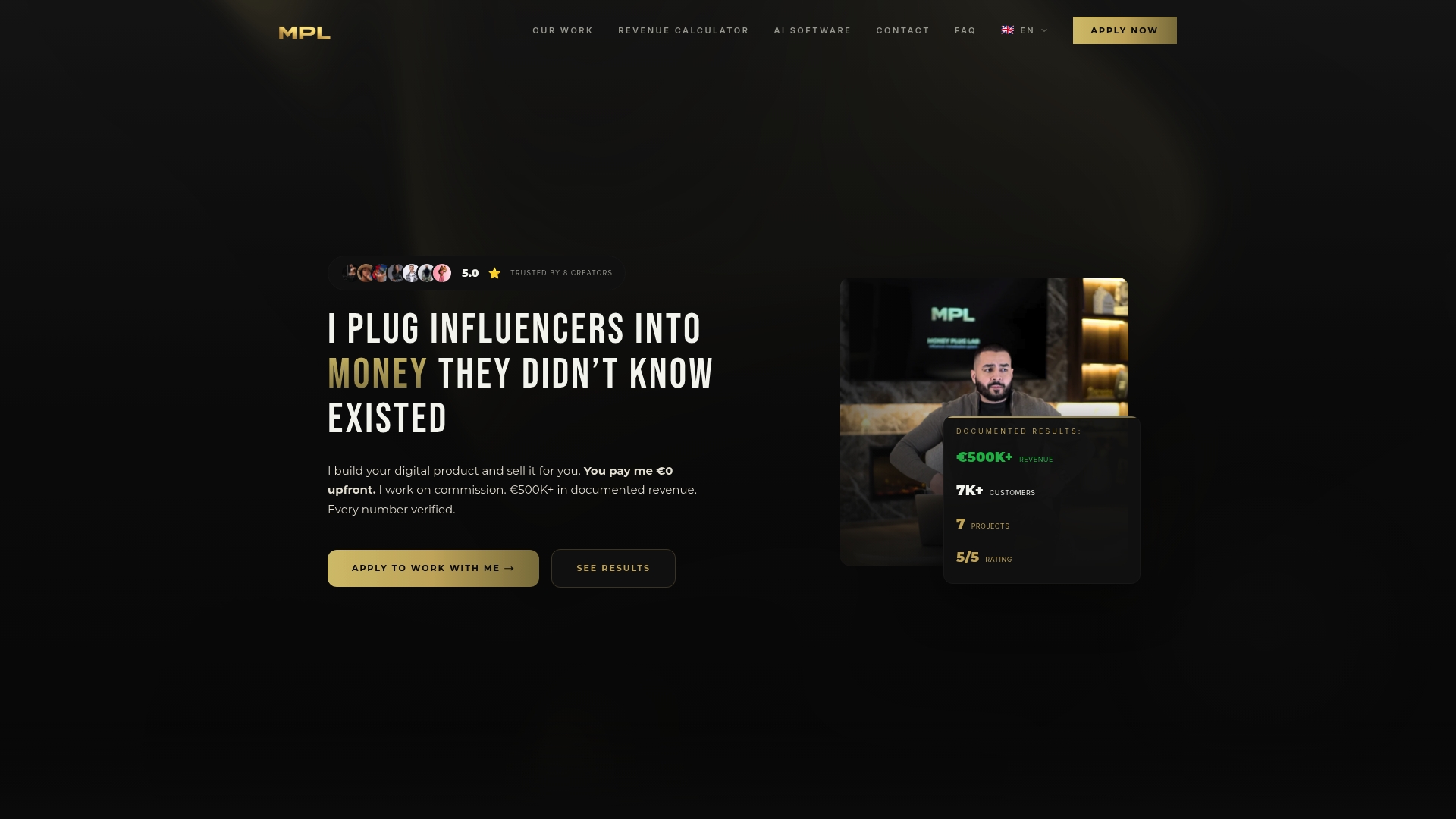
If you are a fitness creator, coach, beauty creator or athlete with an engaged audience and have never sold a product, the checkout is only one piece you would need to build. Money Plug Lab handles audience research, product design, pricing, sales copy, video sales letters, payment infrastructure, launch campaigns and paid ad post-production, on a revenue-share basis with no upfront cost.
See how digital product monetization with PlugReach could work for your audience. For more on the payment side, browse our articles on payment processing optimization.
FAQ
What is a good checkout conversion rate for a digital product?
There is no single benchmark that fits every creator, because traffic source, price and audience warmth change the result. Track your own rate by device and source, then compare it with your own past results. A cold audience from a story link will convert differently from your email list.
Which booster should I do first?
Start with the ones that remove effort: cut optional fields, make guest checkout the default and put wallet buttons at the top on mobile. These are low-risk and supported by usability research. After that, work on payment options and clear terms.
Should I offer a payment plan?
For higher-priced programs, usually yes. A monthly figure is easier to say yes to than a lump sum. Show both options on the same screen, state the date of the next charge and keep the total clear.
Do trust badges really help?
They help when they are specific and sit near the payment form, such as a recognizable processor logo, a secure-payment indicator and clear refund terms. Baymard’s research reports that about one in five US shoppers has left a checkout over distrust of card handling, so reassurance at the point of payment matters.
How long should I run a checkout test?
Run it through at least one full sales cycle, including weekends and any promotional spikes, and judge it on completed purchases. Stopping early on a lucky streak is a common way to ship a change that does not work.
Sources
- Baymard: Checkout UX best practices 2026
- Baymard: Minimize form fields, research article
- Baymard: Average checkout form fields and steps
- Shopify: Checkout optimization complete guide (2026)
- Stripe: Checkout optimization tips
- Stripe: Checkout flow design strategies
- Trust badges research review